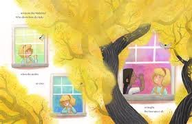
When I pick up a children’s book, I’m not just looking at the words on the page; I’m looking for that immediate, magnetic pull of the art. Too often, we talk about writing as the primary engine of a story, but anyone who has genuinely observed a child with a picture book knows the truth: the illustration is half the conversation, sometimes more. The most captivating children’s books achieve a kind of beautiful synchronicity where the visual narrative carries just as much weight as the textual one. It’s a delicate, powerful dance, and getting it right is the difference between a book that’s simply read and one that’s genuinely experienced and loved.
The moment a child opens a book, their brain, which is far more visually oriented than an adult’s, is drinking in the colors, the shapes, and the expressions. This immediate connection is what starts the lifelong journey of reading. If you’re interested in the power of visual storytelling, especially in content designed for younger audiences, take a look at the kinds of stories and engagement you can find when you explore the magic of visual learning on YouTube.
The real problem I see, particularly in less successful books, is an illustration that just mirrors the text. If the text says, “The cat sat on the mat,” and the picture is just a cat sitting on a mat, the illustration has failed to earn its space. Vibrant illustration doesn’t just decorate the words; it expands them, offering context, emotion, and subtle details the writer never had to explicitly spell out. This visual layering is what turns a simple story into a rich, complex experience for a young mind.
The Silent Narrator: How Visual Storytelling Works
Visual storytelling in children’s books operates on a completely different plane than its textual counterpart. It’s the silent narrator, filling in the emotional gaps and providing a constant, stable presence for the reader. When I’m evaluating a picture book, I look for several key ways the illustration is actively contributing to the narrative.
I. Establishing Tone and Atmosphere
The first glance at an illustration sets the mood. Is the story whimsical and light, or perhaps a little mysterious and thoughtful? The artist controls this instantly through color palette, line weight, and composition.
- Color Palette: A story meant to be calming might use soft pastels and cool blues, creating a gentle atmosphere that encourages a quiet, reflective pace. Conversely, a story about adventure might explode with high-contrast, saturated colors—vibrant reds, sunny yellows, and deep greens—to signal excitement and energy.
- Composition: The way an illustrator arranges elements on a page tells you where to look and what to feel. A lot of empty space around a small character might convey loneliness or vastness, while a page crammed with detail suggests chaos, excitement, or a busy setting.
- Line Work: Thick, scratchy lines can suggest energy, movement, or something slightly unsettling. Clean, simple lines create a sense of order, friendliness, and clarity, which is often crucial for the youngest readers.
My Personal Insight: I remember one book where the text described a character feeling “a little nervous,” but the illustration showed the character’s shadow being disproportionately huge and menacing. That visual detail instantly elevated the emotion from “a little nervous” to genuine, understandable fear, without adding a single extra word to the text. That is the power of a strong illustrator.
II. Revealing Character and Subtext
A good writer gives us details about a character, but a great illustrator shows us the character’s internal life. The visual cues often carry the subtext—the meaning beneath the surface words.
| Visual Element | Textual Description Example | Illustrated Subtext (Hidden Meaning) |
| Eye Contact/Gaze | “She looked at her brother.” | Her eyes are slightly narrowed, conveying suspicion or mischief. |
| Body Language | “He walked across the room.” | His shoulders are slumped, and his hands are in his pockets, revealing shyness or reluctance. |
| Setting Details | “It was his bedroom.” | Piles of books and an old globe are visible, suggesting he is a curious, imaginative child. |
Illustrations are especially crucial for conveying universal emotions that pre-readers can’t yet process through language. A picture of a character’s face contorted in a silent laugh or a dropped toy next to tearful eyes speaks volumes, bridging the language barrier for babies and toddlers.
More Than Just Captivating: The Educational Imperative
The role of illustration extends beyond simple aesthetic pleasure; it is fundamentally intertwined with literacy development and cognitive growth. For a young child, the process of reading a picture book is actually a complex, multi-modal exercise.
The Visual-Verbal Connection
Children use the illustrations as scaffolding for understanding the text. They look at the picture to confirm or clarify the meaning of a word they don’t know, a process known as visual context clueing. This is not cheating; it is a vital part of language acquisition.
- Prediction: A child sees a picture of a wide, muddy path and a raincoat. They predict the text will involve rain or an outdoor adventure.
- Confirmation: The text reads, “He splashed in the puddles.” The picture confirms the action and adds detail to the meaning of “splashed.”
- Vocabulary Expansion: The text mentions a “barrow.” The picture shows a wheelbarrow, immediately assigning a concrete image to the abstract word, making the word stick much faster.
This constant back-and-forth between word and image strengthens their comprehension skills and builds a foundation for reading longer, text-only books later on. It teaches them that information can come from multiple sources and must be synthesized.
Developing Visual Literacy
In a world increasingly dominated by images, the ability to “read” a picture is just as important as reading a sentence. Good illustrations teach visual literacy by encouraging children to:
- Follow a Sequence: The progression of illustrations across a spread or through a series of pages teaches the concept of time and cause-and-effect.
- Identify Symbolism: Recognizing that a dark cloud might symbolize sadness, or a glowing light might symbolize hope, is the first step toward understanding literary symbolism.
- Focus on Detail: The complexity of the art encourages them to scan the page, notice the small mouse hidden in the corner, or the subtle change in the character’s expression—training their observational skills.
For parents and educators who want to truly embrace this dual-learning approach, seeking out materials that are specifically designed for engaged, visual learning is key. Finding resources that offer unique learning tools for families can make a huge difference in how a child connects with a story.
What Makes an Illustration Truly Vibrate with Story?
Having worked with hundreds of picture books over the years, I’ve developed a strong sense of what separates adequate art from art that truly elevates a story. It often comes down to the illustrator’s ability to create tension and offer something new.
The Principle of Juxtaposition and Tension
The magic happens when the image doesn’t just repeat the text but adds a contrasting or supplementary layer of information. This is juxtaposition, and it’s the heart of sophisticated picture book art.
- Example 1 (Humor): The text might say, “She was perfectly calm.” But the illustration shows the girl standing still amidst a catastrophic mess—a stack of pancakes on the ceiling, the family dog wearing a hat made of laundry, a fire extinguisher smoking in the corner. The humor comes from the visual contradiction of the text.
- Example 2 (Irony/Drama): The text says, “They were safe in their home.” But the image shows the character looking out a window, and through the glass, we see a giant, ominous shadow, hinting at a threat the character is either unaware of or ignoring. This builds dramatic tension for the reader.
| Illustration Quality | Effect on the Reader | Pitfall to Avoid |
| Visual Pacing | Controls how quickly the eye moves across the page, creating suspense or swift movement. | Too much detail on every page, which tires the reader’s eye and slows the pace to a crawl. |
| Emotional Consistency | The characters’ feelings are visually reliable and progress believably throughout the story. | Characters’ expressions looking wooden or generic, failing to reflect the emotional beat of the text. |
| Sense of Scale | Uses size effectively to convey importance or perspective (e.g., a tiny child next to a massive tree). | Everything rendered in a bland, standard, and uninteresting size. |
The best illustrators are masters of this kind of visual dialogue, understanding when to pull back and let the text breathe, and when to step forward and let the image completely dominate the narrative. It’s about intentionality in every single brushstroke and color choice.
Frequently Asked Questions About Picture Book Art
How does art style affect a child’s engagement?
The art style is crucial because it influences the emotional connection. A bold, graphic style might appeal to a child who prefers clear, direct information, while a softer, watercolor style might draw in a child who likes gentle, imaginative stories. The best style is one that is consistent and serves the story’s emotional core, not one that’s simply trendy. My experience has been that children connect deeply with styles that clearly convey emotion through faces and movement.
Do detailed illustrations or simple ones work better for very young children?
For very young children (toddlers and early pre-schoolers), simpler, high-contrast, and uncluttered illustrations are generally more effective. Their developing brains can process single, clear concepts better. As they get older (around 4-6), they start to appreciate and benefit from more complex, detailed pages, as this encourages the development of observational skills and sustained attention. It’s a developmental progression.
Can an illustration “save” a weak story?
Absolutely, and I have seen it happen many times. A text that is a little too thin, a bit cliché, or lacks dynamic pacing can be transformed by an illustrator who provides depth, humor, and a compelling visual world. If the art is rich in subtext, character detail, and visual drama, the reader will engage with the pictures and use them to fill in the gaps left by the writing, essentially creating a richer story in their own mind.
What is “gutter-jumping” in a picture book?
“Gutter-jumping” refers to the artistic choice to have the illustration stretch continuously across both pages of an open book, crossing over the central fold, or “gutter.” This technique is primarily used to create a sense of sweeping expanse, vastness, or an intense, dramatic moment that requires the full visual real estate. It’s an excellent way to slow the reader down and emphasize the scope of an image.
Conclusion: The Whole, Inseparable Story
The enduring success of the classic picture book is a testament to the fact that reading is not a singular activity—it is a conversation between the text, the images, and the mind of the reader. Illustration in children’s literature is not a secondary embellishment; it is a powerful, sophisticated language in its own right. The best picture books achieve a kind of narrative fusion where it is genuinely impossible to tell the story by just looking at the words, and equally impossible to understand its deeper meaning by only looking at the pictures.
The art informs the rhythm of the read, dictates the emotional landscape, and provides the vital visual scaffolding that turns an abstract word into a concrete, memorable idea for a child. When I look at a book where the illustrator has truly succeeded, I see a narrative that is dense, rich, and complete, offering layer upon layer of meaning that encourages multiple re-reads. This is why great illustrations don’t just captivate young minds; they cultivate them, making the earliest steps into literacy an unforgettable, vibrant adventure.


